- Joined
- Feb 21, 2013
- Messages
- 1,392
The RSS icons are back to front, they are normally dim, then appear better when hovered, I keep thinking they are dirty marks on my screen
The RSS icons are back to front, they are normally dim, then appear better when hovered, I keep thinking they are dirty marks on my screen
HAHAHAHAhahahahahahaha.Alright, who's hacked Mark's account?
I'd go as far as to say this is the best XenForo style I have seen.
I would respectfully disagree. This knocks spots of that.To be honest I prefer the theme Admin Talk uses. I wasn't that keen on it first, mainly because of the green colour. But it's grown on me and think the theme itself is very well put together.
I found the AE theme to bold, lots of bold colours which just looked "off"
This theme is a lot softer on the eyes, more pleasing and easier to read.
Not enough padding right, too much padding bottom.
Taz
View attachment 10397
Admin Addict
View attachment 10398
Compare both and see what I mean.
Really nice job! Only one small thing I saw...
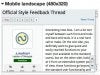
At 480px wide, the Poster information takes up quite a bit of real estate—I'd change the configuration to the one you have for narrower widths sooner.